In section of the blog, I will be talking about the target audience that my Ident appeals to. To make it easier to understand, the post will be split into 6 sections.
Age:
The age group for my ident is young adults around 18-35.
Gender:
With the conventions used, the ident appeals to the Male gender.
Interests:
Science fiction, Action
Class:
Middle-class
Geographical:
First world, english speaking. Mainly american and british.
Hobbies:
Adrenaline junkies, thrill seekers, logical people
Thursday, 15 October 2015
Friday, 9 October 2015
Idents: What are they? And, what are their uses?
What is an Ident?
 An Ident is a logo for a production company that is shown before their Films or TV shows. Some examples of idents are the Universal Studios Ident (shown to the right). Idents can have a series of different factors that are incorporated into them. These includes; animation, 3D designs, title sequences and opening/closing credits. In fact, the Universal studios ident shown to the right is a great example of 3D design as the camera movements show that indeed the globe in the image isn't 2 dimensioned but instead, third.
Animation
For years, Idents have been using animation to enhance the way their visuals. Animation have changed the way idents flow. Originally, Idents were still images displaying the logo, name and some imagery to make it look fancy. Nowadays, thats quite standard. We see it everywhere, magazines, newspapers, websites etc. So, too keep their Idents memorable they have to step up their game and keep reinventing them. One of the techniques was animation. Animation has been used for many years, and Universal Pictures began with their very first animated ident back in 1941. Where text, orbited about the planet. Nowadays, a similar animation is still used. At the beginning you see the text appear over the horizon of the Earth and then swoop past the camera. This is the same movement as the 1941 ident, but with a few difference. In the new ident, the words stop in the centre instead of continously flowing round and in the new ident, we see the words pan in a close up whereas before it was always a wide shot.
Away from Idents, animation is used for many other things as well in aspects of motion graphics. If you ever see anything move on your screen (i.e. text, shapes, effects, people) then you can say they have been animated. Animation is the illusion of giving something fake, life. For example, Toy Story (1995) is completely animated and each of the characters would have been designed and moved to look real and further, tell the story. As the years have gone by, and the rise of visual effects replacing most of practical effects nowadays, animation is being used more then it ever has. For films such as Transformers (2007) the robots are visually designed and calculated with mathematics for the components to work as the animator moves the rig of the model.
3D Designs
 Just like animation, 3D design is a relatively old format but in recent years its usage has increased dramatically due to its huge technical enhancements towards reality. The way designers can composite imagery into a frame with a 3 dimension axis is becoming a sense of trickery. In the 2009 reboot of Star Trek, the closing credits was one of the best I have ever seen, and still is. The mixture between VFX and Motion Graphics created an mini-galaxy tour displaying the key names of the films production. Since we aren't talking about the visual effects, we'll ignore that and talk about the text in the image found above. Of course, the first name displayed is the director JJ Abrams, but the techniques used to blend the text with the background as it slightly pans from the left to the right from that rapid zoom in with used by key framing which is a technique used in post to animate certain layers to control their properties (i.e. Scale, orientation, movement, opacity and more.) These techniques are used to animate the text and change it from an image into a graphic. These techniques are used all the time in film, such as in girly soap operas on MTV where they display a text message on the screen, the stars in Paramount, the WB slow upscale, etc.

Title sequences
 In Hollywood films, it very rare to ever see title sequences but some films have them. These can be in the format of opening and closing credits. But an example of a title sequence would be Guy Ritchie's character introduction on the film Snatch (2000). At the beginning, you follow the diamond going from one character to the next, then again and again until all the main characters have been established. But the trick is, when each character get the diamond, they film stops in freeze frame and a 3D design is placed over the top with the characters posture and their name. Another big director who enjoys his Title sequences is David Fincher who makes similar abstractly themed imagery to what Bond does (but obviously Fincher and Bond films are wildly different genre and therefore themed films.) An example of an opening credits is The Girl with the Dragon Tattoo (2011) its imagery stays true to overall colour palette, with the play on a lot of greys and black being manipulated into 3D models of oiled objects. I.e. Faces, liquids, etc. This is done for to engage audience's attention from the beginning as people are fascinated by the weird, or abstract. It also conveys the tone of the films with pacing, colours, and some of the objects that are being made give hints into the film, though the majority of them are either random or are currently beyond me.
Animation
For years, Idents have been using animation to enhance the way their visuals. Animation have changed the way idents flow. Originally, Idents were still images displaying the logo, name and some imagery to make it look fancy. Nowadays, thats quite standard. We see it everywhere, magazines, newspapers, websites etc. So, too keep their Idents memorable they have to step up their game and keep reinventing them. One of the techniques was animation. Animation has been used for many years, and Universal Pictures began with their very first animated ident back in 1941. Where text, orbited about the planet. Nowadays, a similar animation is still used. At the beginning you see the text appear over the horizon of the Earth and then swoop past the camera. This is the same movement as the 1941 ident, but with a few difference. In the new ident, the words stop in the centre instead of continously flowing round and in the new ident, we see the words pan in a close up whereas before it was always a wide shot.
Away from Idents, animation is used for many other things as well in aspects of motion graphics. If you ever see anything move on your screen (i.e. text, shapes, effects, people) then you can say they have been animated. Animation is the illusion of giving something fake, life. For example, Toy Story (1995) is completely animated and each of the characters would have been designed and moved to look real and further, tell the story. As the years have gone by, and the rise of visual effects replacing most of practical effects nowadays, animation is being used more then it ever has. For films such as Transformers (2007) the robots are visually designed and calculated with mathematics for the components to work as the animator moves the rig of the model.
3D Designs
 Just like animation, 3D design is a relatively old format but in recent years its usage has increased dramatically due to its huge technical enhancements towards reality. The way designers can composite imagery into a frame with a 3 dimension axis is becoming a sense of trickery. In the 2009 reboot of Star Trek, the closing credits was one of the best I have ever seen, and still is. The mixture between VFX and Motion Graphics created an mini-galaxy tour displaying the key names of the films production. Since we aren't talking about the visual effects, we'll ignore that and talk about the text in the image found above. Of course, the first name displayed is the director JJ Abrams, but the techniques used to blend the text with the background as it slightly pans from the left to the right from that rapid zoom in with used by key framing which is a technique used in post to animate certain layers to control their properties (i.e. Scale, orientation, movement, opacity and more.) These techniques are used to animate the text and change it from an image into a graphic. These techniques are used all the time in film, such as in girly soap operas on MTV where they display a text message on the screen, the stars in Paramount, the WB slow upscale, etc.
The main difference between Visual Effects and Motion Graphics is that Visual Effects are computer generate elements that are implemented into a frame purposed to be blended in as if it was there when shooting. Motion Graphics are just graphic designed animated in and around the frame. So, in the screen shot above, I've stated that the typography is an example of motion graphic where as the visual effect is everything else from the flares, shading, planets, debris, etc.
Example of Motion Graphics in House of Cards (2013-)
 In Hollywood films, it very rare to ever see title sequences but some films have them. These can be in the format of opening and closing credits. But an example of a title sequence would be Guy Ritchie's character introduction on the film Snatch (2000). At the beginning, you follow the diamond going from one character to the next, then again and again until all the main characters have been established. But the trick is, when each character get the diamond, they film stops in freeze frame and a 3D design is placed over the top with the characters posture and their name. Another big director who enjoys his Title sequences is David Fincher who makes similar abstractly themed imagery to what Bond does (but obviously Fincher and Bond films are wildly different genre and therefore themed films.) An example of an opening credits is The Girl with the Dragon Tattoo (2011) its imagery stays true to overall colour palette, with the play on a lot of greys and black being manipulated into 3D models of oiled objects. I.e. Faces, liquids, etc. This is done for to engage audience's attention from the beginning as people are fascinated by the weird, or abstract. It also conveys the tone of the films with pacing, colours, and some of the objects that are being made give hints into the film, though the majority of them are either random or are currently beyond me.
Monday, 5 October 2015
Breakdown on Professional Idents
In this blog, I will choose 3 different Idents that will be compared for their visual composition, pacing, use of time and the information being given.
Warner Brothers, Harry Potter: Deathly Hallows (Part 2) (2011)
 This is the ident specially made for the finale of the long running Harry Potter Saga. The ident within itself has a duration of 26 seconds. The overall tone of the ident has clearly been based of Harry Potter, which would the be logical assumption given thats what the ident is for. The pacing is slow, to match the films bleak and sad beginning before the finale really starts. The use of time is rather unconventional. 26 seconds, although doesn't sound like a lot, is. If you watch the ident, not much happens. It starts with the Warner Brothers logo slowly moving from the back to foreground and then you get a camera angle into the lettering giving a nice parallax finishing with a cross-dissolve to blend the next section in. The information given is designed so that you can look at that warner brothers logo and given you have seen any of the later Harry Potter films, you should be able to tell that this ident was based around it. For comparison purposes, heres a screenshot of Voldemort from the film.
 As you can see, there is a lot of Greys and Blacks, with slight whites to give contrast in the image. The film was visually corrected and graded in post to give this image along with set and costume design to give the same colour palette that ultimately tells you that the end is near. All this visual information has been incorporated into the ident, giving it the same feel as the final film is. Further more, unlike the Universal or Fox ident, this ident is always centred with movement. Also, there isn't much information either, the back ground consists of clouds. This is all designed so that your attention, the viewers, is always drawn towards the ident and never comes off.

 Paramount Pictures, 100th Anniversary
Warner Brothers, Harry Potter: Deathly Hallows (Part 2) (2011)


Underneath is the original warner brothers logo. As you can see form first glance, its somewhat similar to the logo but the main attraction is the shape and typography. These two haven't changed much, although have evolved due to the limits of technology further itself from 2D design. This logo was from 1925, 90 years ago and 86 years before the logo displayed above first reached the screen. Despite the fact the logo has obviously changed, its still similar enough to make an educated guess to which production company it was. Even though the shape and the typography has stayed the same, the composition of the image the same. Its still 100% based in the middle of the image, which is safe to say because the image has no movement in it unlike the new zoom.
 Paramount Pictures, 100th Anniversary
Paramount is the same age as Universal Studios (both established in 1912). So in 2012 both companies celebrated their big 100th anniversary and by doing so, every film they released that year had a very special ident made for them. Paramount has always been known for its mountain with the stars. The image below, compared to the Warner Brother image above, is very bright and visually disgraces Warner Brothers. Again, the composition is made so that the logo is made in the centre of the screen to gain attention and express its priority to there rest of the image. But, Warner Brothers structured theirs to not have much detail but still be visually dramatic. The idea Paramount was to give a breathtaking image that you could ideally look at for a long period of time so that its got a larger chance of sticking in your mind. In terms of pacing, the ident is much faster paced then any other ident i've seen, even arguably faster then Universal. This is because we constantly jump framing, we start of with a close-up, follow the stars through and then end with a small zoom outwards to give a larger perspective. Warner Brothers is just a zoom, and even though Universal is indeed similar and to me, more visually complex, the Paramount ident has much more information thrown at you with all the camera movement thrown across. In certain ways, this indent more simplistic designed compared to that of Warner Brothers. The above Warner Brothers ident was specifically designed to conclude one of its highest grossing film series ever. Whereas the Paramount is an anniversary, so both would have their differences and purposes.
 To the left is the paramount ident. At first glance you can see that then ident has not changed much at all. The overall look is the same, except for slight design differences in the background. Just like Warner Brothers, the original ident doesn't have any motion and is practically a picture. But, back then the technology was much lesser and peoples expectations were also less. This plays a massive part in the visual composition and the information conveyed; the current demographic group, which is why the ident changes to keep in trend with its audience. The hardest part would be keeping the iconography of your Ident for the face of the brand whilst balancing that connection with your audience.
Columbia Pictures
 Back in 1924, Columbia Pictures was founded. Currently, it acts a division of Sony, releasing all of the Sony films. In terms of Ident, the Columbia Picture Ident (as seen to the left) is very similar to that of the Paramount ident. The beginning opens with the Sony logo (because its "a sony company") which then zooms into the lettering, and you seen a big flare of light. This flare of light is the torch seen in the ident. As you can see, the woman is actually Lady liberty that you would see in Paris and but most famously New York. The ident from here gets slower until eventually its comes to a halt and the typography of Columbia appears behind. This entire ident is made up of 2 shots, and spans a total of 33 seconds opposed to the Warner Brother's 26 seconds. Despite being longer, the ident for Columbia Pictures feels faster, this is because of the information conveyed is much greater. Theres always something new to look at. So where as Warner Brothers have the quicker, more boring (opinion based) ident, Columbia Picture has the longer, more cinematic and interesting ident. This has been done for a reason though, as discussed above, the Warner Brothers ident was specifically made for Harry Potter and the Columbia Pictures Ident is their 2014 updated version. The main attract for the ident though isn't the wording unlike Universal, its actually Lady Liberty. When you look into the meaning of the statue, and why the french made on for the americans, you can see why. The Americans, and somewhat, the rest of the world sees this statue as a monument for hope, and people aboard will fly over to america just to see it. So, having such a famous, and positively seen monument for the production company's iconography will make the viewers see the Statue and link the company with everything the statue is famous for and what it means.
 On the right is the original ident for Columbia Pictures back in 1924. As you can see, the overall composition of the image is the same. Its got a woman that looks like Lady Liberty but in a different pose as the centre point of the image and around her you have clouds surrounding. The lighting in the image is fully on the woman, this shows importance, and directs the eyeline of the viewer as the eye is trained to always go to the bright part of anything. Strangely, the ident doesn't have any wording in it. Unlike Warner Brothers and Paramount Pictures, which do. The overall ident doesn't move either, which is actually expected for the 1920s as camera movements weren't as commonly used (back then it was limited to zoom, pans and tilts anyway). Just like the other idents back in the early 20th century, the ident is surprisingly short compared to what they are today. The Columbia Ident in 1924 was only 6 seconds, but this is because the Ident is basically an image, and didn't have anything visually intriguing for the audience to last more then 15 seconds without being taken out of the immersion thats been set.
Aspect Ratios, Frame rates, Formats and File Compression
In this blog, I will be discussing what Aspect Ratios, Frame rates and Formats are and how they're used.
What aspects ratios?
The aspect ratio is the measurement of the with and the height of the screen. There are many different aspect ratios that have been used on TV and especially for Film. TV was always the ratio of 4:3, this is because the old TVs were the shape of a square. Now days, the modern and standard aspect ratio for TV is 16:9 or widescreen.
What is the difference between 16:9 and 4:3?

As you can see, the 16:9 displays a lot more information on the screen due to its increase size in frame. The reason that the black bars on the 4:3 happen is because some older TV shows that haven't been reformatted will still have that size, but because TVs are now wider, something have to fill that empty space. Despite its old fashioned use, 4:3 is still commonly considered in turns of framing for things such as motion graphics. This is because older TVs won't covert the larger 16:9 down, therefore cropping will happen. So for things such as motion graphics, they have bars on their screen to help them frame all the information so that when the cropping happens, the viewer still sees the information they need. Eventually, the 4:3 ratio will become something of the past as 16:9 feels more native due to our natural eye sight being a wide field of view.
In films, its a slightly different story. Hollywood films have completely switched to the 16:9 widescreen ratio. But, they have different aspect ratios with in that ratio; this is what they call letter boxing. In modern day film cameras, they have crop lines built into the cameras and external monitors to help with this letter boxing. But why? If you've seen a film thats been shot on what they call an anamorphic lens, which you probably have, then you would notice their is black bars on the screen. But, unlike the 4:3, the black bars occur on the top and bottom of the screen.

If you look at the picture to the right, you will see an example of these letter boxing. The reason for this is because when you use an anamorphic lens it distorts the image before it enters the camera. Its a vertical distortion, so when you view the image on a monitor (that isn't able to recompress the image for preview) the frame looks stretched vertically but horizontally its fine. So, when you place the footage in post, you then resize the image and you get an aspect ratio of 2.35:1 which is the standard for film and has been since the 1950s but you could only this ratio in cinemas designed for anamorphic. Nowadays, typically lower budget films are show on 1.85:1.
 The image on the left shows the difference between the two aspect ratios, and you will more commonly see the 1.85:1 being used especially for TV. Its even used on shows like Game of Thrones (2011-) use this ratio. This is mainly due to visual preference but the anamorphic ratio is typically seen to be more cinematic.
Each of the last 3 Idents I analysed used the aspect ratio of 2.35:1 except for the Paramount Pictures. There are two reason to why they have chosen these aspect ratios. The most likely is that the sources aren't consistent in the fact that the two with the anamorphic aspect ratio came from the beginnings of films and the Paramount Pictures (which was 1.85:1) was just a video. The reason that the anamorphic ratio would be used instead of the typical 1.85:1 is because they would blend better with the films that open directly after (sudden changes in aspect ratio is off putting and considered a bad form of editing.) But, from a more creative point of view, this might not be the case. Aspect ratio is completely subjective, different people like different things therefore it largely depends on what the film's theme is or what visual style the director is going for/prefers. Some directors love the 2.35:1 because its the tradition with great conventions, where as others like the newbie 1.85:1 because it feels less intense and doesn't suffocate the audience from information.
File compression
There are two different types of file compression. They are, lossless and lossy. These are two different file types with the same overall season. The idea of file compression is to make a file smaller, this is great for filmmakers as storage is always a concern. The difference between the two types is that Lossless is compressed in size but remains the same quality where as Lossy reduces the size and the quality of the image. These both have their pros and cons.
Lossless, though doesn't lose quality (which is great), doesn't compress as much as lossy does meaning that you still end up with hefty file sizes. Lossy on the other hand, has much smaller files sizes then Lossless but still loses the overall quality.
So, you might be thinking why does Lossy exist if we can just make the files smaller without losing quality? Well, technically the two techniques are for two types of people. In filmmaking, most of us have to use lossy formats, not because we want too but because storage is still expensive to be able to do what studios do. Most of us can comfortably shoot compressed 1080p files and storage them without any need to compression before editing but 1080p RAW still isn't consumer yet because of its files sizes still be huge.
The studio, on the other hand, uses lossless to compress their RAW files. For example, Peter Jackson used the Red EPIC Dragon 6K camera for The Hobbit: Trilogy (2012-2014). They shot the entire film at a unconventional 48 frames per second on 4K RAW. Only a studio really have the technology to be able to hold that size for a film and then run it through compression, but I wouldnt be surprised if they didn't compress it at all and just edited in RAW due to Red's RAW codecs being widely compatible with editing software.
There are four factors that actually contribute towards the file size of a movie file. These are: duration, codec, resolution and frame rate. I will speak about Resolution and Frame rates later, but duration is the time that the movie file takes from start to finish and the codec is the file format in which the camera exports the footage.
Back too lossless and lossy, there are a wide variety of different formats used. These include;
Lossless:

Knowing that studios have immense computing power compared to the comsumer market, I should imagine file sizes for something that is 30 seconds long isn't much of an issue. That being said, the ident is also a representation of the business so the quality is priority. But, when rendering out in Premiere, Lossy files are all you have as exporting RAW isn't avaliable. Therefore, my guess would be either they use higher resolutions and then import that directly into their films edits thus compressing the ident dimensions down to match that of the composition but no pixels would be lost. Thats how I'm doing it anyway.
Formats
.svg/4096px-Digital_video_resolutions_(VCD_to_4K).svg.png) What is meant by the term, Formats? Some people will also call this resolution, like myself. We have briefly spoken about and mentioned about Formats with aspect ratios and file compression and it provides a key role in both. When shoot a film, the format is one of the most visually important considerations you make. Currently, the standard for any video is compressed full HD but it hasn't always been that way. In the past, there have been many resolutions and as technology increased, so did the resolution. Increasing the resolution mean there was more space for the camera to capture pixels. Back in the 1990s, TV formats such as, programmes, advertisements and music videos were all shot around 480p at 4:3 aspect ratio (some using the anamorphic ratio of 2.35:1 but format stayed the same.) As time went on, 480p would still hold its place as the standard until mid 2000s when High definition (or HD) came out. This format was great for its time but was quickly pushed away with Sony's new format BluRay, which brought Full HD to the screens. So whats the difference between 480p (Standard Defintion or SD), HD and Full HD. Well, HD is 720p and Full HD is 1080p, these are bigger resolution with denser amounts of pixels (definition) allowing clearer pictures. For a time, 1080p was the thing to have but now its pretty much consumer, most cameras (including smart phones) have the capabilities to shoot Full HD compressed but 1080p RAW is still a format that isn't consumer but its been so long that no one really cares anymore. This is because a new format has started being used, known as 4K. Now, don't be tricked into thinking 4K is the highest format avaliable, its not. There are cameras out there capable of shooting 6K internally, such as the Red EPIC Dragon. Its also possible to then upscale this to 8K using several methods such as 1.3x anamorphic lens or shooting portrait and then manually blending frames together (which isn't convenient for even industry leaders).
What is meant by the term, Formats? Some people will also call this resolution, like myself. We have briefly spoken about and mentioned about Formats with aspect ratios and file compression and it provides a key role in both. When shoot a film, the format is one of the most visually important considerations you make. Currently, the standard for any video is compressed full HD but it hasn't always been that way. In the past, there have been many resolutions and as technology increased, so did the resolution. Increasing the resolution mean there was more space for the camera to capture pixels. Back in the 1990s, TV formats such as, programmes, advertisements and music videos were all shot around 480p at 4:3 aspect ratio (some using the anamorphic ratio of 2.35:1 but format stayed the same.) As time went on, 480p would still hold its place as the standard until mid 2000s when High definition (or HD) came out. This format was great for its time but was quickly pushed away with Sony's new format BluRay, which brought Full HD to the screens. So whats the difference between 480p (Standard Defintion or SD), HD and Full HD. Well, HD is 720p and Full HD is 1080p, these are bigger resolution with denser amounts of pixels (definition) allowing clearer pictures. For a time, 1080p was the thing to have but now its pretty much consumer, most cameras (including smart phones) have the capabilities to shoot Full HD compressed but 1080p RAW is still a format that isn't consumer but its been so long that no one really cares anymore. This is because a new format has started being used, known as 4K. Now, don't be tricked into thinking 4K is the highest format avaliable, its not. There are cameras out there capable of shooting 6K internally, such as the Red EPIC Dragon. Its also possible to then upscale this to 8K using several methods such as 1.3x anamorphic lens or shooting portrait and then manually blending frames together (which isn't convenient for even industry leaders).
So what formats do Production companies use for their idents? Well it depends on the film. For The Hobbit: Trilogy, they would of made several idents to match the formats and frame rates of each version of the film. Seeing as each of The Hobbit films were shot at 4K 48fps, they would of made several renders for each version. These include;
What aspects ratios?
The aspect ratio is the measurement of the with and the height of the screen. There are many different aspect ratios that have been used on TV and especially for Film. TV was always the ratio of 4:3, this is because the old TVs were the shape of a square. Now days, the modern and standard aspect ratio for TV is 16:9 or widescreen.
What is the difference between 16:9 and 4:3?

As you can see, the 16:9 displays a lot more information on the screen due to its increase size in frame. The reason that the black bars on the 4:3 happen is because some older TV shows that haven't been reformatted will still have that size, but because TVs are now wider, something have to fill that empty space. Despite its old fashioned use, 4:3 is still commonly considered in turns of framing for things such as motion graphics. This is because older TVs won't covert the larger 16:9 down, therefore cropping will happen. So for things such as motion graphics, they have bars on their screen to help them frame all the information so that when the cropping happens, the viewer still sees the information they need. Eventually, the 4:3 ratio will become something of the past as 16:9 feels more native due to our natural eye sight being a wide field of view.
In films, its a slightly different story. Hollywood films have completely switched to the 16:9 widescreen ratio. But, they have different aspect ratios with in that ratio; this is what they call letter boxing. In modern day film cameras, they have crop lines built into the cameras and external monitors to help with this letter boxing. But why? If you've seen a film thats been shot on what they call an anamorphic lens, which you probably have, then you would notice their is black bars on the screen. But, unlike the 4:3, the black bars occur on the top and bottom of the screen.

If you look at the picture to the right, you will see an example of these letter boxing. The reason for this is because when you use an anamorphic lens it distorts the image before it enters the camera. Its a vertical distortion, so when you view the image on a monitor (that isn't able to recompress the image for preview) the frame looks stretched vertically but horizontally its fine. So, when you place the footage in post, you then resize the image and you get an aspect ratio of 2.35:1 which is the standard for film and has been since the 1950s but you could only this ratio in cinemas designed for anamorphic. Nowadays, typically lower budget films are show on 1.85:1.

Each of the last 3 Idents I analysed used the aspect ratio of 2.35:1 except for the Paramount Pictures. There are two reason to why they have chosen these aspect ratios. The most likely is that the sources aren't consistent in the fact that the two with the anamorphic aspect ratio came from the beginnings of films and the Paramount Pictures (which was 1.85:1) was just a video. The reason that the anamorphic ratio would be used instead of the typical 1.85:1 is because they would blend better with the films that open directly after (sudden changes in aspect ratio is off putting and considered a bad form of editing.) But, from a more creative point of view, this might not be the case. Aspect ratio is completely subjective, different people like different things therefore it largely depends on what the film's theme is or what visual style the director is going for/prefers. Some directors love the 2.35:1 because its the tradition with great conventions, where as others like the newbie 1.85:1 because it feels less intense and doesn't suffocate the audience from information.
File compression
There are two different types of file compression. They are, lossless and lossy. These are two different file types with the same overall season. The idea of file compression is to make a file smaller, this is great for filmmakers as storage is always a concern. The difference between the two types is that Lossless is compressed in size but remains the same quality where as Lossy reduces the size and the quality of the image. These both have their pros and cons.
Lossless, though doesn't lose quality (which is great), doesn't compress as much as lossy does meaning that you still end up with hefty file sizes. Lossy on the other hand, has much smaller files sizes then Lossless but still loses the overall quality.
So, you might be thinking why does Lossy exist if we can just make the files smaller without losing quality? Well, technically the two techniques are for two types of people. In filmmaking, most of us have to use lossy formats, not because we want too but because storage is still expensive to be able to do what studios do. Most of us can comfortably shoot compressed 1080p files and storage them without any need to compression before editing but 1080p RAW still isn't consumer yet because of its files sizes still be huge.
The studio, on the other hand, uses lossless to compress their RAW files. For example, Peter Jackson used the Red EPIC Dragon 6K camera for The Hobbit: Trilogy (2012-2014). They shot the entire film at a unconventional 48 frames per second on 4K RAW. Only a studio really have the technology to be able to hold that size for a film and then run it through compression, but I wouldnt be surprised if they didn't compress it at all and just edited in RAW due to Red's RAW codecs being widely compatible with editing software.
There are four factors that actually contribute towards the file size of a movie file. These are: duration, codec, resolution and frame rate. I will speak about Resolution and Frame rates later, but duration is the time that the movie file takes from start to finish and the codec is the file format in which the camera exports the footage.
Back too lossless and lossy, there are a wide variety of different formats used. These include;
Lossless:
- RAW codecs
- H.264 Lossless
- Blackmagic codecs (exclusive to Blackmagic cameras)
Lossy:
- MP4/H.264
- Quicktime
- Windows Media Video
Of course, there are 10s more of each, but they are just common examples.
Here is an example of a lossy format against a lossless format.
Knowing that studios have immense computing power compared to the comsumer market, I should imagine file sizes for something that is 30 seconds long isn't much of an issue. That being said, the ident is also a representation of the business so the quality is priority. But, when rendering out in Premiere, Lossy files are all you have as exporting RAW isn't avaliable. Therefore, my guess would be either they use higher resolutions and then import that directly into their films edits thus compressing the ident dimensions down to match that of the composition but no pixels would be lost. Thats how I'm doing it anyway.
Formats
What is meant by the term, Formats? Some people will also call this resolution, like myself. We have briefly spoken about and mentioned about Formats with aspect ratios and file compression and it provides a key role in both. When shoot a film, the format is one of the most visually important considerations you make. Currently, the standard for any video is compressed full HD but it hasn't always been that way. In the past, there have been many resolutions and as technology increased, so did the resolution. Increasing the resolution mean there was more space for the camera to capture pixels. Back in the 1990s, TV formats such as, programmes, advertisements and music videos were all shot around 480p at 4:3 aspect ratio (some using the anamorphic ratio of 2.35:1 but format stayed the same.) As time went on, 480p would still hold its place as the standard until mid 2000s when High definition (or HD) came out. This format was great for its time but was quickly pushed away with Sony's new format BluRay, which brought Full HD to the screens. So whats the difference between 480p (Standard Defintion or SD), HD and Full HD. Well, HD is 720p and Full HD is 1080p, these are bigger resolution with denser amounts of pixels (definition) allowing clearer pictures. For a time, 1080p was the thing to have but now its pretty much consumer, most cameras (including smart phones) have the capabilities to shoot Full HD compressed but 1080p RAW is still a format that isn't consumer but its been so long that no one really cares anymore. This is because a new format has started being used, known as 4K. Now, don't be tricked into thinking 4K is the highest format avaliable, its not. There are cameras out there capable of shooting 6K internally, such as the Red EPIC Dragon. Its also possible to then upscale this to 8K using several methods such as 1.3x anamorphic lens or shooting portrait and then manually blending frames together (which isn't convenient for even industry leaders).So what formats do Production companies use for their idents? Well it depends on the film. For The Hobbit: Trilogy, they would of made several idents to match the formats and frame rates of each version of the film. Seeing as each of The Hobbit films were shot at 4K 48fps, they would of made several renders for each version. These include;
- 4K resolution with 48 fps (3D)
- 4K resolution with 24 fps (2D)
- Full HD resolution with 24 fps (2D)
- Full HD resolution with 48fps (3D)
There is a common misconception that 4K TVs are quite common to buy. This is wrong, what tend to be called 4K TVs are actually the format Ultra HD format which is similar to 4K with a different width. Not saying genuine 4K TVs dont exist, they do but they are as common as 2K tvs are to Full HD. Companies are exploiting this misconception with even cameras such as the GH4 which shoots a high bit rate of UHD, not 4K. Why does UHD exist then? Because its a direct 4x upscale to Full HD and since Full HD is the consumer standard, it would be illogical to start changing aspect ratios again since everyone is used to 16:9. Basically, 4K nor 2K are 16:9 but instead 16:10.
Frame Rates
Previously, I have mentioned the use of Frames rates through out the explanations above because Frame Rates are key in Film & TV. Frames Rates are a measurement and a format. Dependent on the type of production you are watching will decide the Frame rate for the show. For a cinematic experience, the industry standard is 24fps, for live TV its 60fps and for 3D cinematic films its 48fps. Our eye can identify up to 1000fps but in short terms. Frame rates are measured in Frames per seconds (fps). For example, in cinema for every second of film you watch, your eye processed 24 frames.
So, why have 60fps for Live TV if 24fps is known for its cinematic look? Well, everything up to 60fps is noticeably different. You can see the difference between 48fps and 60fps but once you go over the 60fps marker, it gets much harder. The difference you'll notice when frame rates get increased is the how smooth it feels and 60fps is used for Live TV to give a realistic feel. There is also other reasons to why higher and lower frame rates are used, not just for the smoothness or every how it feels but for its technical advantages. When you see slow motion in films, have you ever wondered how they managed that? Its really quite simple, you put the frame rate up so when you put the video in post, you'll realise that all your film is shot at 24fps but you shot your slow motion video at 48fps (or more). This means you can compress down the frames to 24fps but the video will be slower without any "fps lag" (which is when frames get compressed and information is lost meaning jumping in information.)
Another use for Frame rates, is for gaming. In fact, frame rates have become a big thing for gamers with benchmarks set at 60fps. This is done for the same reasons as Live TV. The extra smoothness the frames add means theres no motion blur so for sporting events, such as Nascar, its great because fast objects become very hard to see with motion blur. But also, some gamers to prefer to play with their frame rates higher then 60fps, this is because some events in games need more frames then others such as explosions compared to smaller muzzle flashes. So when an explosion goes of, the information slightly over runs the processes, meaning frames get lost. So for Gamers with weaker machines that just run at 60fps will fall to 50, sometimes 40, quite often which can make the game feel weird.
More onto the topic of film, 3D films have began to ditch the traditional 24fps with the new 48fps look. But, many people are angry with this. The idea for the switch is because 3D basically have two of the same compositions slightly off-layered so when corrected they give the illusion of one popping out. The two compositions means that double frames are needed for full experience and for films such as The Hobbit: Trilogy this technique was needed. The only problem is, theres a theory that suggests why 24fps looks cinematic and why anything more then 24fps doesn't. So even though, 48fps looks nice and smooth and those who are slightly naive would think this would still give a cinematic because its just a second multiple, it doesn't. Watching a film at 12fps isn't cinematic, its horrible, and 48fps just seems like a weird combination between Nascar and Cinema. Some people liked it though, because the extra double frames means more information getting feed into the retina allowing more detail in the film to be witnessed before the fast cuts.
The sickest game show ever: Press Release
FOR IMMEDIATE RELEASE
The beginning of the new, Sickest Game Show Ever, is closing towards us. Celebrities announced.

Email: sickestgameshowever@legitbusiness.co.uk
Phone number: 0800 123789
Address: 56, Cranes Avenue, London, England, LD1 8GH
The beginning of the new, Sickest Game Show Ever, is closing towards us. Celebrities announced.

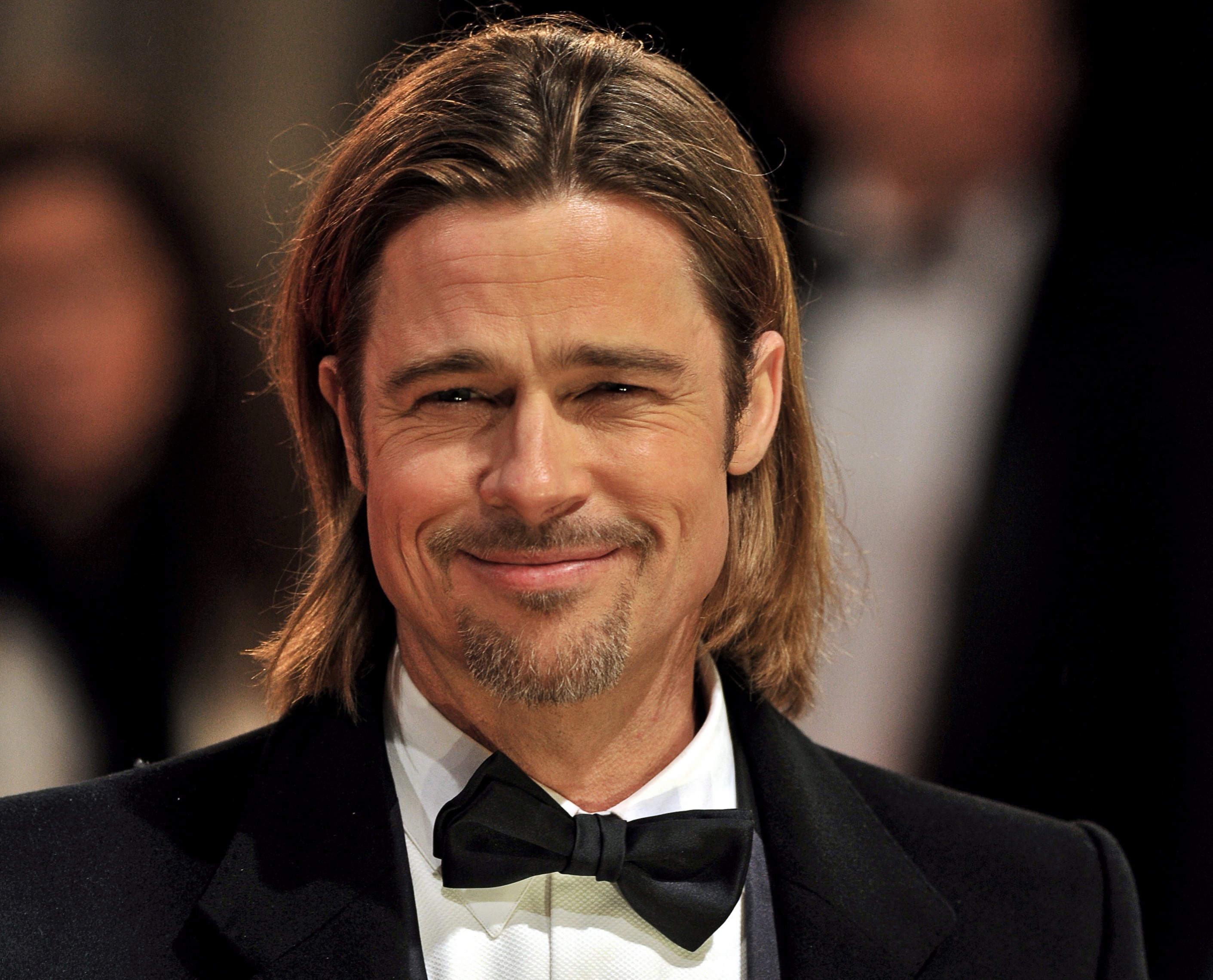
This summer, on ComedyCentral, is coming the greatest show you've ever witnessed. It contains 4 stages of trials that puts the public alongside randomly chosen celebrities and shows them work together as a unit to face other teams for the top position and the prize. The show will be presented the one and only Tom Cruise, who to our surprise volunteered himself due to his recent commitment to commentary on documentaries. Some of the other celebrities involved are Brad Pitt, Angelina Jolie, Jennifer Aniston and Ben Affleck.
 The show will go broadcast on its first season on ComedyCentral on Monday 5th October 2015. Along with a wide variety of people, Brad Pitt has decided to express his excitement for the release by saying "Being asked to do a show like this is an honour. You don't get to sit down and watch a unique show that is fun for all the family, let alone be apart of such a show. I'm truly excited to greet my team and go on to win the games in the upcoming weeks!" What a lovely comment from Brad Pitt indeed.
Email: sickestgameshowever@legitbusiness.co.uk
Phone number: 0800 123789
Address: 56, Cranes Avenue, London, England, LD1 8GH
Breakdown of Show
Synopsis
100 contestants get split into 4 teams of 25. Each team has their own colour and celebrity captain; Red, Blue, Green, Yellow. Each team will compete against one another in a series of challenges, involving obstacle, races, team vs. team death match. The entire competition is knockouts, so when a contestant fails, they are out. The last team with any remaining contestants win.
Presenter
For a presenter, I'd probably do a series of interviews for different presenters and voice actors. The idea is to get a very vocal individual with a deep voice (almost like a narrator that film trailers used to have).
Formats
One season will be cut into 4 sections; Trials, Quarter-finals, Semi-Finals and Finals.
The trials is the initiation section, where members of the public are put against trails to get into the quarter-finals. At the end of the trails, to determine which team each member is put into, they will be asked four questions that are taken from a system of a further 14 questions. Each question has four options, each option opting a team. Which ever option is most common will be forwarded as their future team.
The quarter-finals are a cataclysmic series of events. Due to the substantial amount of people, this is the section where most people will be eliminated. They will be tested in 4 different styled races, each person has a partner to help them; team work is needed. As the races proceed, lesser and lesser people will proceed.
The semi-finals is a medieval styled challenge. Each team has a base, and two sections to their team; an offence and defence. The captains (celebrities) will decide who goes in each section, and it will begin as a capture the flag for a certain amount of time. If the time runs out, and no flag has been captured, the time will expire and the competition becomes a sudden death. Each existing member has 1 life, if they are hit, they become eliminated. At the end, the succeeding team takes the top scoring members to the finals. Whilst the other team captains will have to choose 4 other members to take with them into the finals.
The Finals is the climax of the series, where each team will divide their team into sections based on physical and mental attributes, such as; Strength, Speed, Agility and Logical Intellect (problem solving, i.e. puzzles). Each member will be aided with their captain and will be put up against the opposite teams in challenges relevant to their attributes. The two top scoring team will go head to head for the trophy. This includes a climbing obstacle, the first team to get all their members to the top win.
Music
In terms of music, I would want something modern, catchy, exciting/adrenaline pumping and definitely atmospheric (though not to the stage of Hans Zimmer, but that could also be a possibility). Further to the point, there would need to be an array of songs to choose from. The song described above would be the main theme, but the rest need to be varied so that we have a song for every setting, emotional, action packed, dramatic, chilled, etc. This is so that we have constant music broadcasting live to audience and hopefully with a professional live sound editor, the production value should increase. The way I see it, the music can be as or even more important then the script.
Tone
Its an entertainment show that is based towards family for humour. Therefore it can't be bleak and depressing, nor can it be overly happy to the point it feels patronising. It's in the middle; meaning it has its lows and then it has its highs. That's what the audience want to see, that emotional engagement between the public and the celebrities and to see the team come together to win.
Set Design
It has to feel familiar but not to the point where its unoriginal and cliché. Each set builds up its design to feel more and more intriguing until it hits the final which would be the biggest, brightest, more complex and most exciting design of the crowd. But, don't take what I said too drastically, the first set still needs to be big and somewhat powerful too get the audience interested instantly. Each set will have a theme, and of course there will be several sets on each stage except the last stage which will be one big combination of each theme! On each stage, the themes will be based off speed, intellect, strength and agility.
Subscribe to:
Posts (Atom)